Introduction to Colour Psychology
Hey there, and welcome back to Arange Interior Design. If you’re new here, don’t forget to hit that share button, give this article a thumbs up, and ring the notification bell so you never miss any of our tips and tricks on making your home truly spectacular. Now, let’s dive into today’s exciting topic: color psychology in home design—creating mood with hues. We all know that color can transform a room.
Think of how a fresh coat of paint can completely change the vibe of a space. But did you know that the colors you choose for your home can impact your mood, emotions, and even how you feel in a room? That’s right. Color psychology is a powerful tool. And today, we’re going to explore how you can use it to create a space that looks and feels great.
How to Use Colour Psychology in Interior Design
Understanding Colour Psychology
So, what is color psychology? Simply put, it studies how different colors affect our emotions and behaviors. It’s been used for centuries in everything from marketing to design. And when it comes to interior design, choosing the right hues for each room can elevate the space, making it more functional, inviting, and even more relaxing. We’re going to walk you through some of the key colors and how they influence the mood of your home. Ready to unlock the power of color? Let’s get started.
Calming Blues
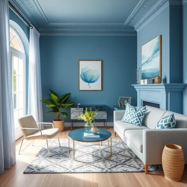
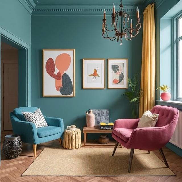
First, let’s talk about blue—one of the most popular colors in home design. Blue is often associated with calmness, peace, and tranquility, making it perfect for spaces where relaxation is key, like bedrooms or bathrooms. If you want a serene atmosphere, consider using soft shades of blue, like powder blue or light azure, on your walls or accessories. A blue accent wall can bring a sense of depth to the room, making it feel spacious and open.
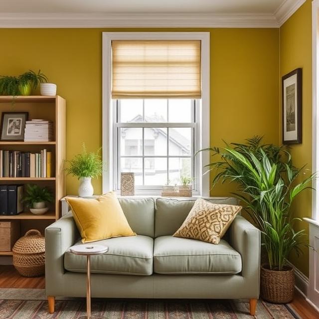
Energizing Yellows
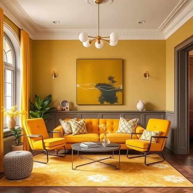
Now, I know what you might be thinking. Blue is great for relaxation, but what about energy and motivation? Well, that’s where yellow comes in. Yellow is the color of optimism, creativity, and joy. It’s energizing and uplifting, which makes it an excellent choice for kitchens, dining rooms, or home offices where you need a boost of motivation. Remember, while a sunny yellow can lift spirits, too much can feel overwhelming. So, balance it out with neutral tones like white or gray if you use yellow on the walls.
Passionate Reds
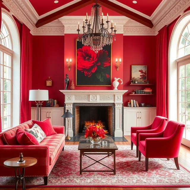
Speaking of energy, let’s move on to red—the color of passion, excitement, and action. Red can increase energy levels and stimulate the senses, making it an ideal choice for spaces where you want to feel inspired and alive, like a living room or a dining area. But be careful, as too much red can create an environment that feels too intense. Instead of painting entire walls red, try incorporating it through accent pieces like cushions, curtains, or a statement chair.
Balancing Greens
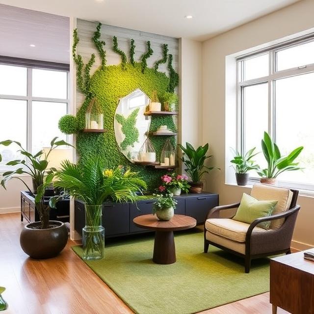
If you love the idea of an inviting, comfortable space, green might be your go-to color. Green is deeply rooted in nature and symbolizes growth, balance, and renewal. It’s the perfect color for creating a peaceful atmosphere, which is why it works so well in bedrooms and living areas. It’s also an excellent choice for plants. So, you can combine the psychological benefits of green with the actual greenery in your space. Whether it’s a lush forest green for a dramatic effect or a soft sage green for a more subtle vibe, green is a mood enhancer.
Vibrant Oranges
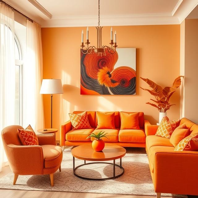
Next, we have orange, the color of warmth, enthusiasm, and vibrancy. Orange can help create a lively, happy atmosphere, which is perfect for spaces where you entertain guests or spend time with family. It’s especially effective in dining rooms and kitchens where you want to create an inviting and energizing environment. However, like red, it’s best used in moderation, as too much orange can feel overstimulating. A few bright orange accents, like throw pillows or artwork, can add the right touch.
Sophisticated Purples
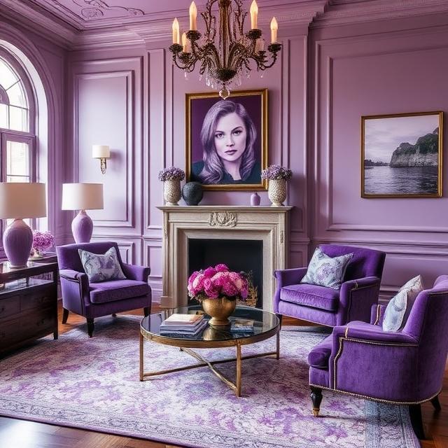
If you want to create a cozy, luxurious, and sophisticated space, then purple is the way to go. Purple has long been associated with royalty, creativity, and spirituality. Lighter shades of lavender can bring a sense of calm and relaxation to a bedroom, while deeper shades of plum or violet can create a dramatic effect in a living room or dining room. Purple is perfect for creating an intimate, calming atmosphere and adding a touch of elegance to your home design.
Timeless Neutrals
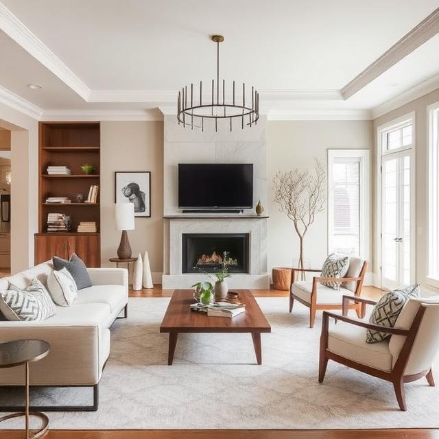
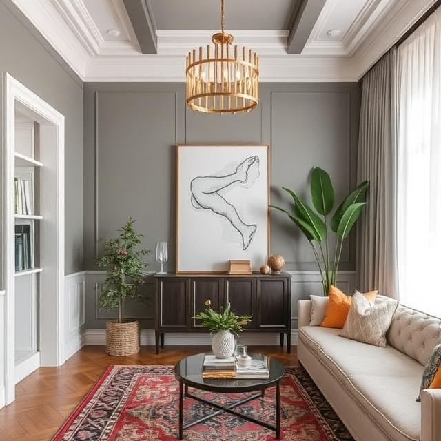
Now, let’s talk about the power of neutrals. These colors, such as whites, grays, beige, and taes, are classic choices for home design because they work with any style and can help create a soothing, timeless backdrop. Neutrals are perfect for larger spaces or areas where you want to let other elements like furniture or artwork take center stage. However, don’t think neutrals are boring. They can be layered in shades and textures to create depth, warmth, and interest. Plus, neutrals can make other colors pop. So, feel free to add a splash of something bold to a neutral-toned room to make it more dynamic.
Personal Colour Associations
But here’s the thing about color psychology. It’s not just about picking a color based on its general meaning. You also need to consider how the color makes you feel. After all, everyone has personal associations with specific colors based on their experiences and preferences. For example, if you associate blue with the ocean and feel relaxed every time you’re near water, then blue might be the perfect choice for your home, even if it’s not the most calming color for someone else.
Creating Colour Schemes
It’s also important to consider your home’s overall color scheme. Creating a cohesive color palette is key to making your space feel balanced and harmonious. You can go for complementary colors like blue and orange or analogous colors like blue and green, which sit next to each other on the color wheel. If you’re unsure about your palette, a neutral base is always a safe and flexible option, with pops of color to keep things interesting.
Real-Life Examples
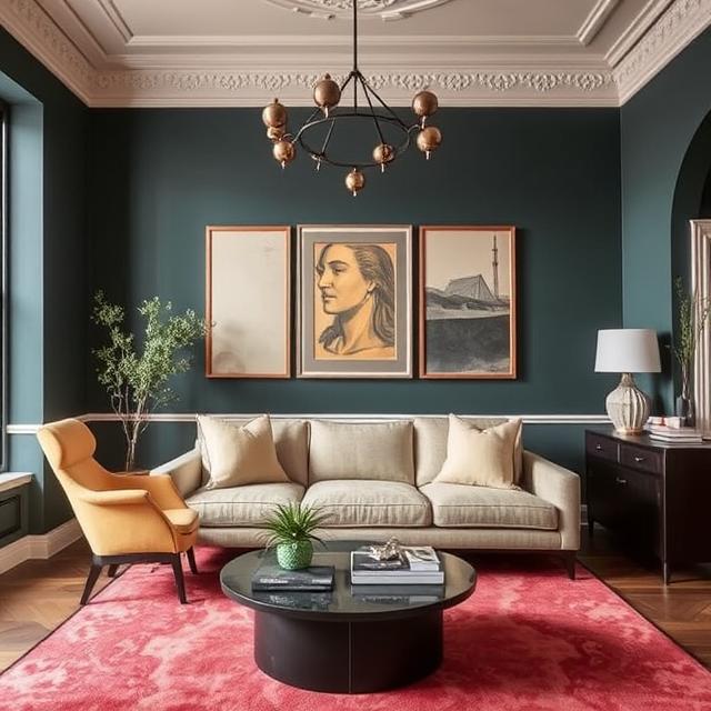
Let’s examine a couple of real-life examples. Take a look at this living room. Notice how the soft gray walls are complemented by touches of mustard yellow in the cushions. The gray provides a neutral, calming base, while the yellow adds a cheerful, welcoming vibe. This creates a perfect balance between a room and another example: a bedroom. The colors work together. It’s a perfect design.
Practical Considerations
So far, we’ve covered how to consider how you want to benefit from energizing colors like yellow and red while decorating the bedroom. Think about natural light. The amount of light a room gets can affect how colors appear. A bright room can handle darker, richer tones, while a dim room can handle lighter, brighter colors to make it look more used. If you’re unsure about a color, try smaller clothes, rugs, or tests. Always try out painting.
Conclusion & Call to Action
There you have it. Color psychology is a fascinating way to influence the mood of your home or make it a space that truly reflects your personality. The possibilities are endless, from creating a serene retreat with calming hues to energizing a room with bold colors. Please share, comment, and subscribe if you found this article helpful. Let me know in the comments what colors you are excited to try. If you have any color psychology tips, feel free to share them with us. Thanks for tuning in, and we’ll see you in the following article. Happy decorating.